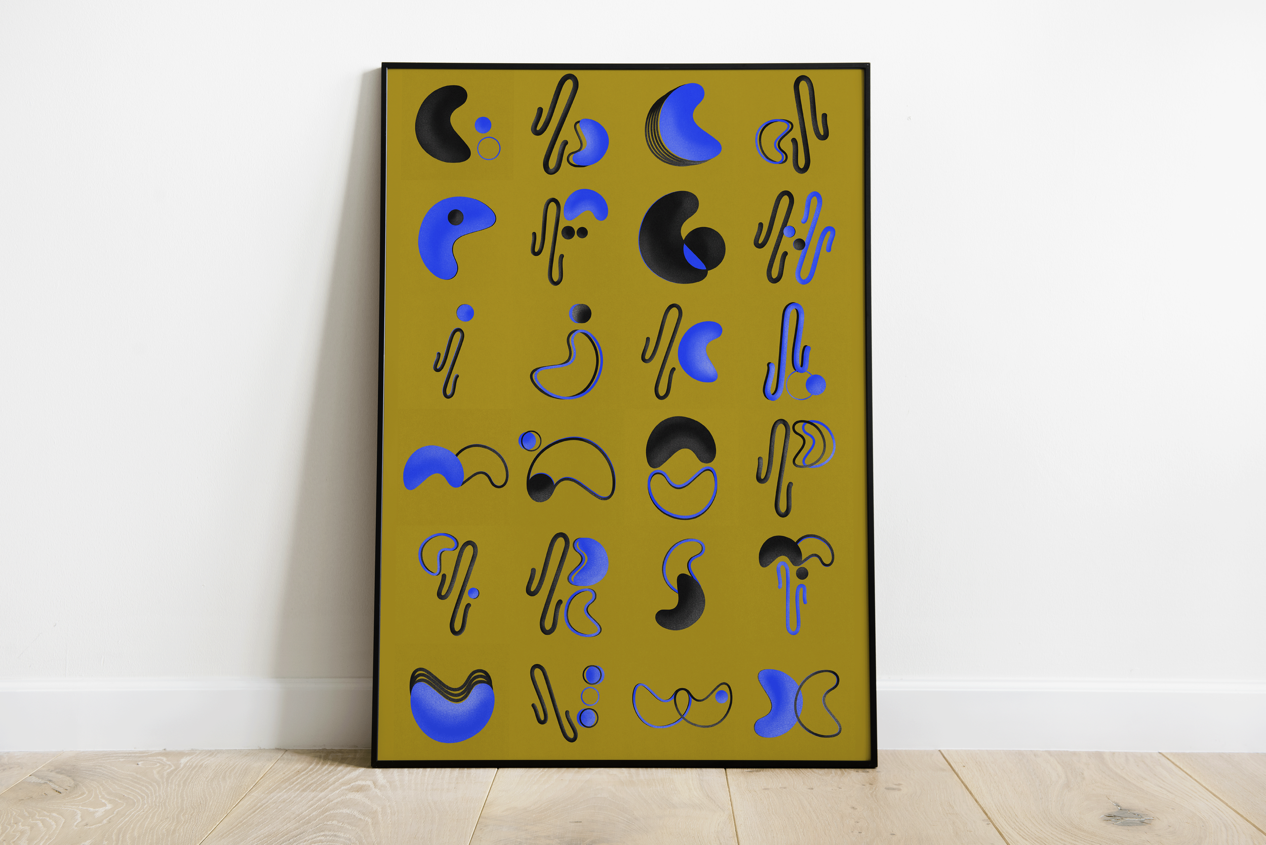
36 Days of Type
I spent a month challenging myself to design each letterform in the Latin alphabet with a self-imposed set of constraints.
Process -
I leveraged three unique shapes (bean, squiggle + circle), and two colors (black and cobalt blue) to form the foundation of each letterform. To add depth and dimension, I layered highlights and grain texture.
Goal -
Break out of my comfort zone, show up consistently online, and use the #36daysoftype challenge as a daily creative practice. I’ve always enjoyed experimenting with lettering, and this challenge gave me more insight into the process of building a cohesive typeface from concept to execution.


